
Update (1-6-17): The results are in! Go here to see the winners!
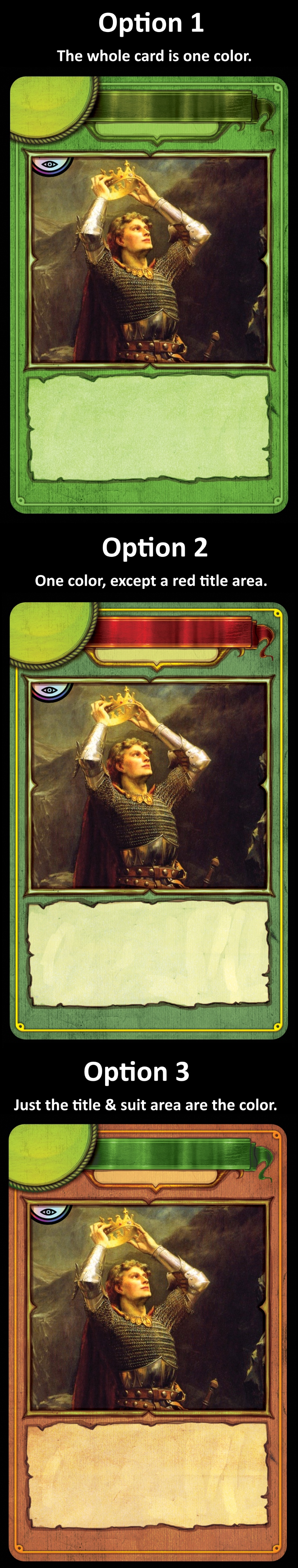
There are three main options for how to give each card a color affiliation, and you get to vote on your favorite below!
Now let’s compare them all side by side:
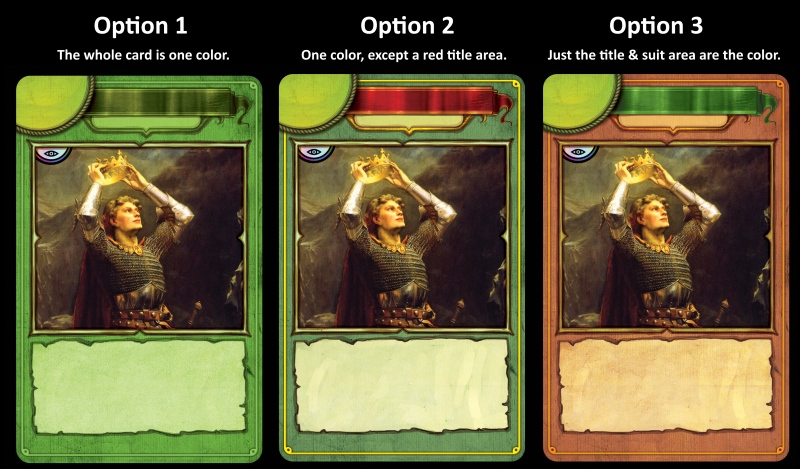
Other than the main colors, more minor changes could be made. It is likely that the border will be larger than what you see here because of possible drift — when the cards are printed, they might not be perfectly centered all the time. Note that the lower text box in the third version below is an older concept, and I wanted it to be higher, so that I can fit the copyright and artist info below the text box.
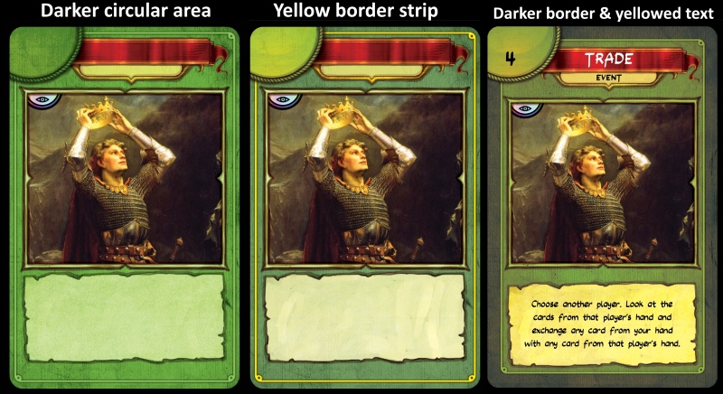
You can vote for your preference regarding some of these options:
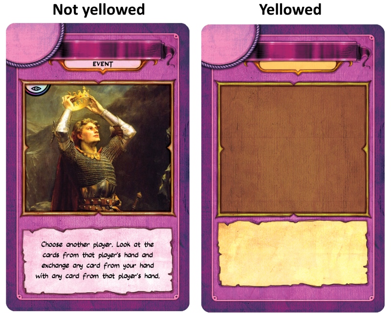
A yellowed text area might look better on green cards than blue or purple cards. Take a look at the purple options below.

wow, I am in the minority on a lot of the options…
Anyway, for the first poll I like option 2. It sets the card name very distinctly, but still shows the color of the card clearly.
I went for the Yellow border strip, even though it will look strange on the yellow cards. It just seems to go with the flavor better and sets a nice demarcation for the edge of the card.
The poll hides what I voted on afterwards, but I know I chose the yellowed text box so it has that old-timey parchment look.
Thanks for your input! Option 3 won for now, and it does have a bit of an old timey look to it.