
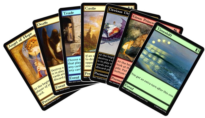
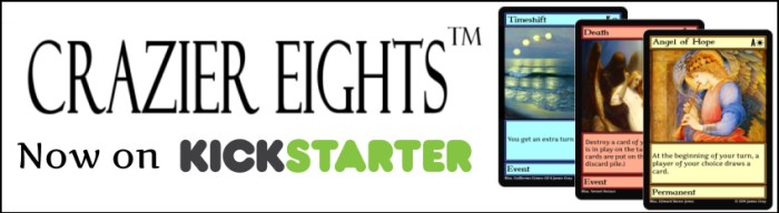
Some people have suggested making changes to the Crazier Eights card frame (template design), which has an area for the card name on the right left side, the suit and rank on the right hand side, and so forth as the following:

I am happy with the current card frame, but I will say a bit about the potential alternatives that have been suggested. If you strongly think I should make a change, you can let me know.
Option 1: Reverse rank/suit placement
Regular playing cards have the rank and suit on the upper left-hand side, and some people think it would be easier to see that information based on how they hold the cards if it was on the traditional upper land-hand side. I personally never felt like the cards needed the rank or suit to show on the left-hand side, but some other people do seem to feel differently about it.
What is this all about? Sometimes people hold the cards like this:
As you can see, this way of holding the cards can make it harder to see the rank and suit.
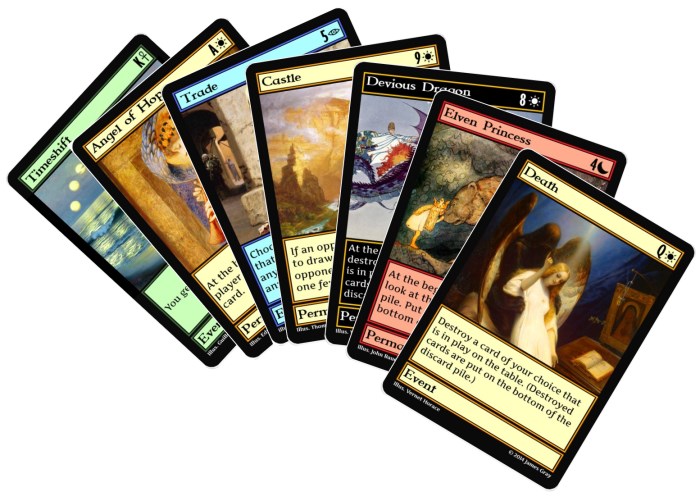
Here is a comparison between the current card frame and the suggested change:

Note that the card name could be a bit more centered rather than to the left hand side of the card.
With the change, people holding the cards might see the following:
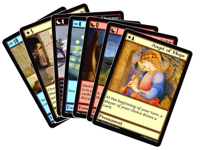 However, I think it is possible to hold the cards in a similar way with the current card frame and still see the rank and suit, like this:
Some people also think the rank and suit is unnecessary because every card of each rank have the same name/image. That is true, but (1) the suit helps color blind people see what color the card is, (2) the cards could be used as a regular deck of playing cards, and (3) the advanced version of the game needs them because all the cards in there are unique, and (4) you could use Crazier Eights first edition with second edition cards as long as you use the rank of the cards.
Option 2: Larger rank/suit
;
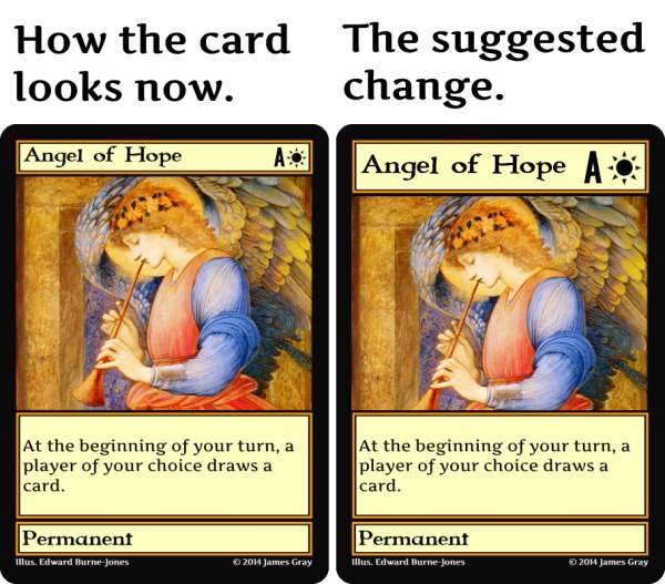
Some people thought the rank and suit shown on the cards is a bit small. I don’t feel like this is an issue, but I don’t think the change would necessarily be a bad thing. Here is what a larger rank and suit could look like on the cards:
Option 4: Card type higher up
It has been suggested that the card type box could be higher up. That would be more traditional (like how Magic: the Gathering looks). I kind of liked how my template was a bit unconventional, but you can let me know what you think. a comparison between the current card frame and the suggestion can be seen as the following:

There are three reasons that I would prefer not to change the card frame other than the fact that I feel like they are okay as they are currently. One, it would take some work to change all the cards in these ways. Two, I have already been promoting the game using the current templates. Three, anyone who prefers the current templates would be disappointed if they were changed.
Related: Ideas for Changing the Look for Crazier Eights

hi James
i like how it looks
don’t change it it gonna start confusing me lol
brandy
Thanks for the feedback.
definitely want the card type at the bottom. In that way, cards in hand have two areas of interest, the top and bottom. I think the idea of putting the type in the middle comes from Magic the Gathering play testers who want the cards to look familiar to what they know. I could go either way for the placement of the rank / suit. The suit is obvious due to the color of the card. The rank only really matters in the more advanced versions of the game where you cannot just match the art as a substitute for knowing the rank.
I do not like the larger card name line as it takes away from the art. I would not be against a larger rank / suit if it were in a separate bubble overlaid next to the name.
Thanks for letting me know.
Actually I just realized that you can really only use the first edition with the second edition cards if the cards have a rank. That is another use for rank.
Definitely put rank and suit on the left. That’s how nearly everyone holds cards.
I will keep your thoughts in mind.
I write my 2 cents here…
– The exclusive cards is awesome+2. I mean, Exclusive contents for every project are awesome… but this card is more than that. 🙂
– About the card frame format:
— I think I like your Option 1: Reverse rank/suit placement. It seems more handy to me. –I don’t like Option 2 (the more Artwork, the better!) or Option 4 (too similar to M:tG format card)
This said, I’ll be happy whatever format you’ll adopt. 🙂
Let’s see what other backers think..
I kind of feel like reversing the rank/suit placement is awkward, but I am certainly considering changing it.