
 The artist Amit Ghadge from Crimson Studio has been working a lot on the card frame color options. There’s split cards and wild cards as well.
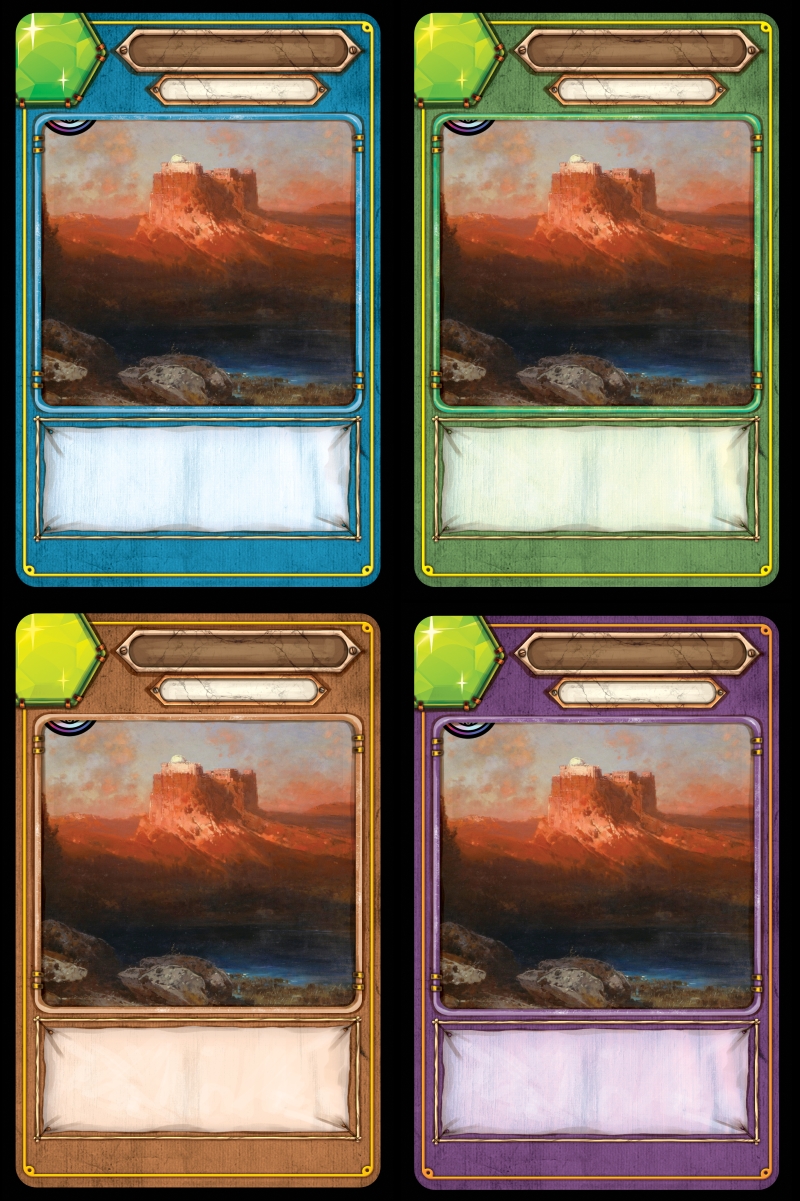
Regular cards
Here’s the current look for the regular cards.

Note the artist also improved the look of the cards a bit. Look at how the card type area’s curvy areas on each side are now easier to see, and how the center pointy bit on the card type area now aligns better with the illustration area.


One thing about the new look that I think I will want to be changed back is the lighter shade bordering the text ribbon. Now it is more monochromatic.
Wild cards
The original color option for the wild cards had a colored card frame, gray title area, and green gemstone:
There’s now a new option that matches the regular card better and with gemstones of different colors. I am thinking the gemstones have lost some detail, and I am hoping we can restore the detail on them.

Do you want the wild cards to stay mostly brown, or do you like the whole card having the same color? Use the poll below to let me know what you think.
Split cards
The first option for the split cards looked like this.
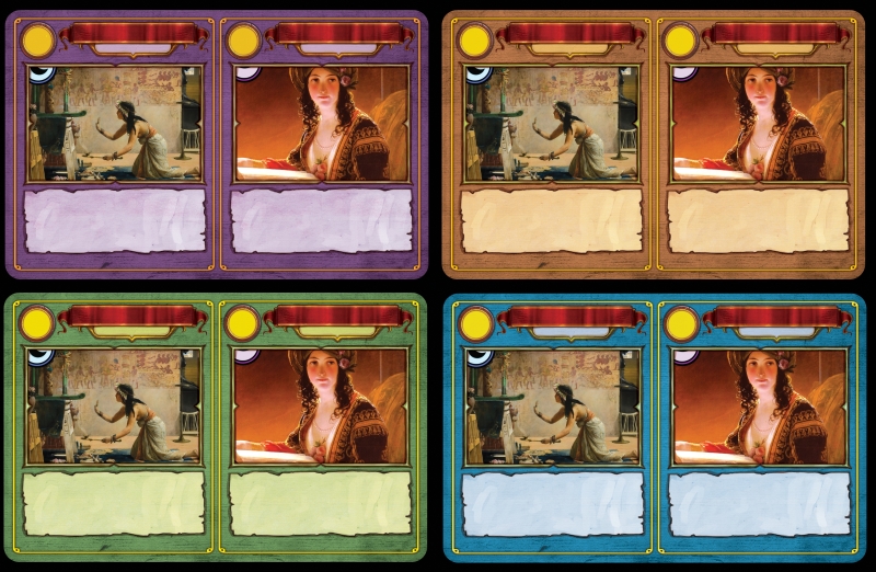
The new split card look matches the regular card look, like this.

My original split cards had a border in the middle of the card that was the same size as the regular card border, and I am thinking that will look better. Look below to see for yourself.

Use the poll below to let me know what you think.
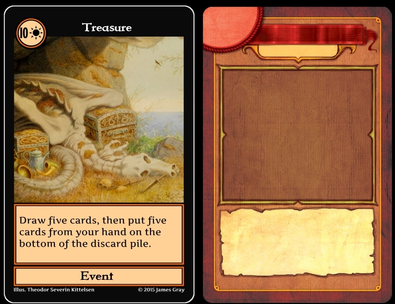
Orange cards
I am thinking about replacing orange cards with red cards. I like the red cards the artist developed so far. The orange cards don’t look quite right, but the regular card looks a bit gold. A gold card could also be interesting… Even so, we can work on making the orange cards look more orange.

Here’s a comparison of the current orange cards with a new red look.
What do you think?

While I did vote for the switch from orange to red, there are some downsides to consider…like the fact that you will now have red and green in the set or it is getting closer to Uno. At least you are still using purple instead of yellow.
Yes, I agree. Red is less unique.