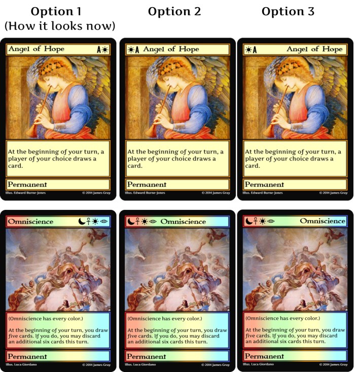
 I asked people what their thoughts were concerning the Crazier Eights card frame a while back, and there was a somewhat consistent request to change the card frame to have the rank and suit on the upper left hand side of the cards. I need to know what everyone thinks about this suggestion so I can make a decision.
There are three main options I am considering using for the card layout. Let me know which of them you prefer. There are two different cards shown for each layout, so that you can see what the layout looks like for more than one card.


As already said, I am fine Either with Option 1 or 3.
Yes, I got a few comments on the Kickstarter update here. Two votes for “1 or 3” and one vote for 3.
I hope to get enough feedback to know which option is best in a day or two.
I feel like option 3 is a bit awkward. That’s a pretty unusual way to format things. Perhaps option 2 for the angel wasn’t far enough from the symbols as well.