
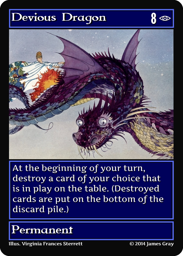
 I feel like the new wild card frames I made yesterday might be a bit inconsistent with the regular card frame. I made some frames that look a bit more like the regular card frame I could use instead. Take a look:


Here’s a darker version I could use:

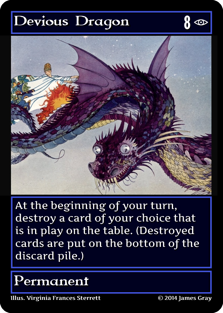

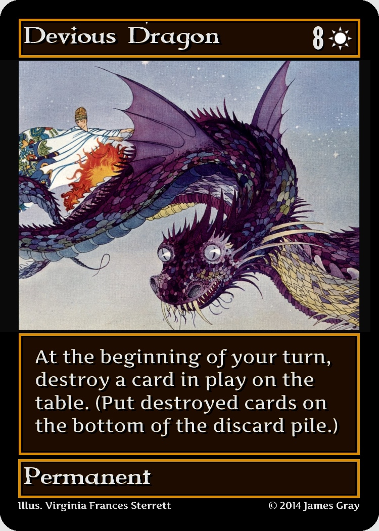
Here is a side by side comparison of all seven options (including other dark variations):

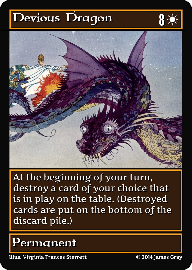
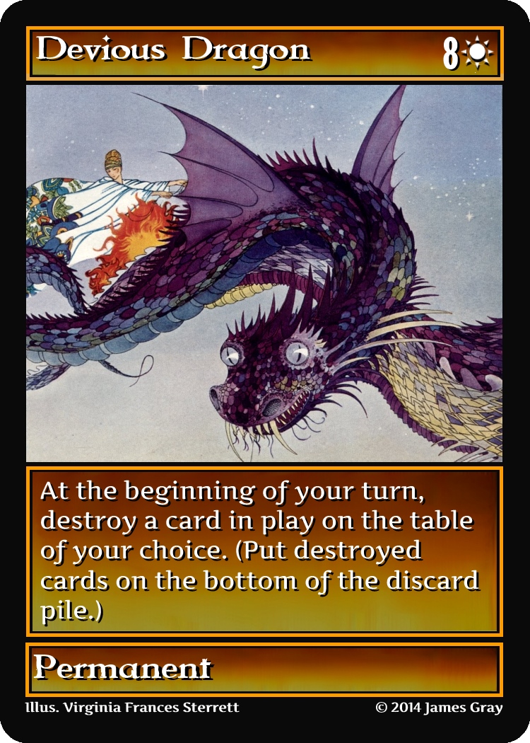


We can refer to each of these frames as the following: (1) Dark 1, (2) Dark 2, (3) Dark 3, (4) Dark 5, (5) darker shiny, (6) shiny, (7) regular card frame.
Do you have a preference of one frame over another?

Why does (2) have different templating? It seems simpler to me. Although you could remove the term ‘destroy’ altogether (which gets rid of the need for reminder text). ‘At the beginning of your turn, you must choose put a card in play on the bottom of the discard pile’
As far as borders go, I like 5 and 6. 1, 2, and 3 are a little dark for color matching.
Think it has different templating just because I messed it up. I will keep destroy, and the second advanced version of the game will no longer have reminder text.
Thanks for the input.
I am thinking 5 and 6 are also harder to read. Not sure that 1, 2, or 3 are that hard for color matching because there’s still an outline of color.
I could also consider making the suit symbol a certain color.