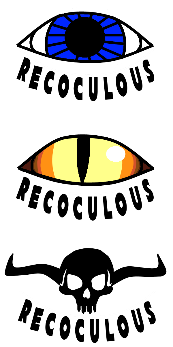
I have registered the fictional name “recocuous,” which can be used as a company name. The games could be considered to be “recoculous games.” One question is what type of logo to use for it. I have designed three options, and you can let me know if any of them appeal to you. (Note that I have another website at recoculous.com)

I think the middle eye looks the coolest, although the top eye is also nice and simple. The skull is not terrible but I think it’s the worst one
Thanks for the input. I was leaning on the skull.
Right now I am going to try using the middle one (a dragon’s eye), but there is a small chance of changing my mind. I might change the letters around a little as well. They aren’t quite as round looking as I would like.
I think the skull is the coolest